

Put yourself out there.
Branding.
Once you have a formalised marketing strategy we help you to put your updated school brand out there.
We design and produce fresh, creative and consistent brand content, informed by all the right information.
-
• Brand identity design
• Brand identity guidelines
• Marketing HR recruitment and advice
• Research
• Print design
• Uniform
• PR and comms
• Press ads
• Signage
• Governors advice, including M&As
• Staff appraisals
• Podcasts
• Presentations
• Copywriting
• Event design and management
• Interior design advice
• Speechwriting

Case Studies


Channing.
Girls enjoying success.
Refreshing an existing identity with project management to create a cohesive, consistent image throughout all marketing materials.
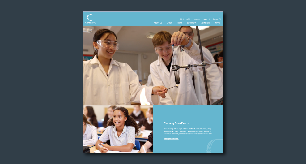
Website design for Channing.

Video production for Channing.
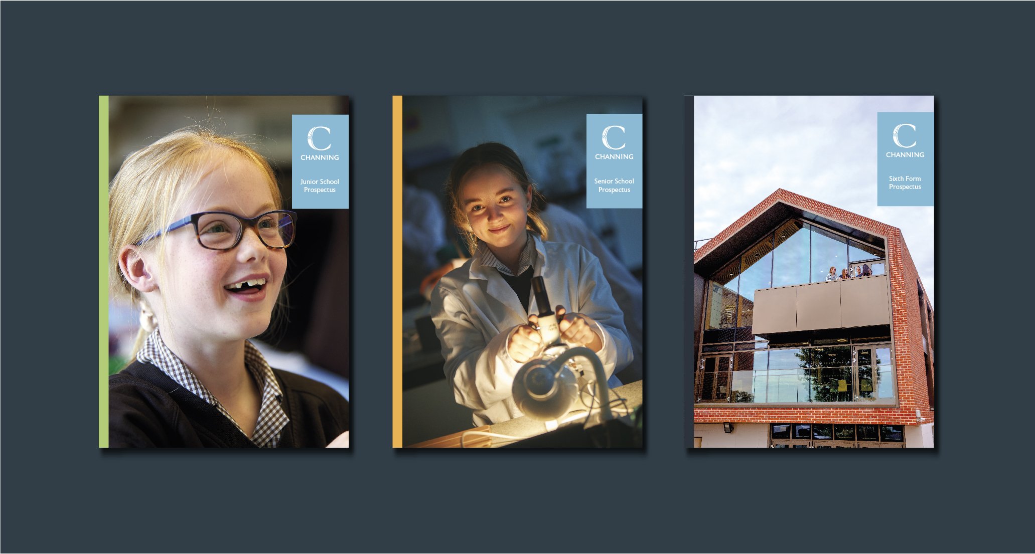
Prospectus design for three school sections at Channing (covers).

Signage for newly built The Arundel Centre.

Logo design for houses at Channing.

Sutton High School.
Updating the brand as part of the GDST refresh.
Converting the logo from quiet to strong, joyful and confident. The chosen logo was inspired by a fondly held architectural detail of the school - its porch - an open welcoming door to the School.

Proposed logo designs for Sutton High School referencing significant local emblems.

Brand guidelines booklet for Sutton High School (powerpoints, prospectuses and letterheads).

Brand guidelines booklet for Sutton High School (signage and livery).

King’s Ely.
Where education is an adventure.
The new logo combines the heritage of the city, its cathedral and the River Cam with the future-facing educational ethos of the School.

Logo design for King's Ely which, when horizontal, reveals the letters K and E (King's Ely).

Logo designs for each section of King's Ely School.
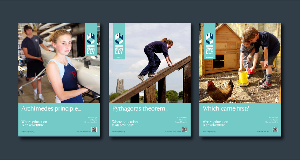
Poster design for King's Ely, with thematic one-liners.
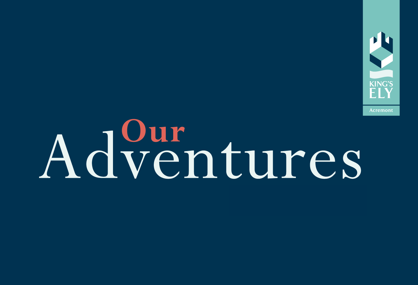
Yearbook design for King's Ely: Early Years 'Our Adventures' (cover).

Yearbook design for King's Ely: Early Years 'Our Adventures' (interior pages).

Woldingham.
An enduring identity.
Designed in 2008, this was our first design for a school as part of a complete Brand Audit. The symbol of the sacred heart is ensconced within the protective framework of the ‘W’ that is Woldingham.

Bag design for Woldingham School featuring the pink which nows forms part of their logo.

Woldingham School's current logo, a development of our original.


The Granville School.
The destination for girls’ independent education in Sevenoaks, Kent.
Updating the symbol of the dove to provide something memorable and instantly recognisable, referenced across stationery, livery and advertising.

Ad design for The Granville School, featuring the signature swoop which references the dove.

Bus decal design for The Granville, School featuring the signature swoop.

Signage design for The Granville School.
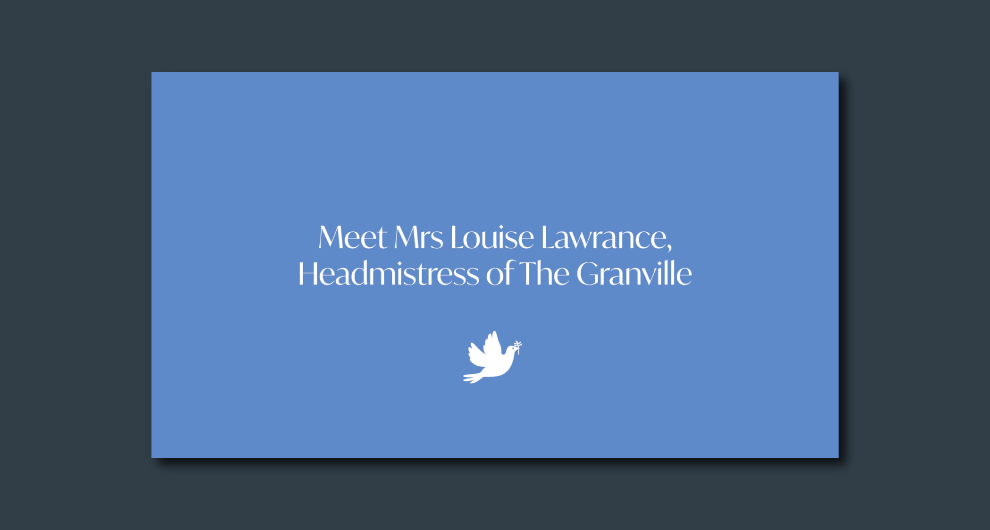
Video production for The Granville School.

Website menu re-design for The Granville School. A secondary bar was introduced to improve the site's UX.
King’s House Richmond.
Specialist in boys’ education, transitioning into co-education.
Creating brand communication materials to reflect the warm and inclusive spirit of the school. PR materials for co-ed transition.

Logo redesign for each section of King's House School, Richmond.

Business card design for King's House School, Richmond.

Prospectus design for King's House School, Richmond (interior pages).

Prospectus design for King's House Nursery, Richmond (interior pages). Illustrations by Reed BC.

Compliments card design for King's House Nursery, Richmond. Illustrations by Reed BC.

Virtual Open Day design for King's House School, Richmond featuring Virtual Tour.
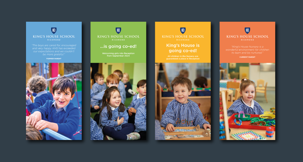
Banner design advertising transition to co-education for King's House School, Richmond.
Saint Christina’s School.
‘A great life…a great beginning’
Future-facing prep education in North London informed by Catholic values.

Prospectus design for Saint Christina's School (interior pages).

Map illustrations for Saint Christina's School, featuring nearby landmarks.

Ad design for Saint Christina's School.
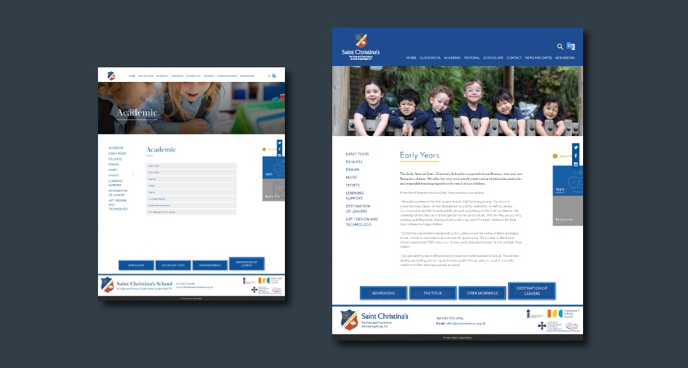
Website menu redesign for Saint Christina's School.

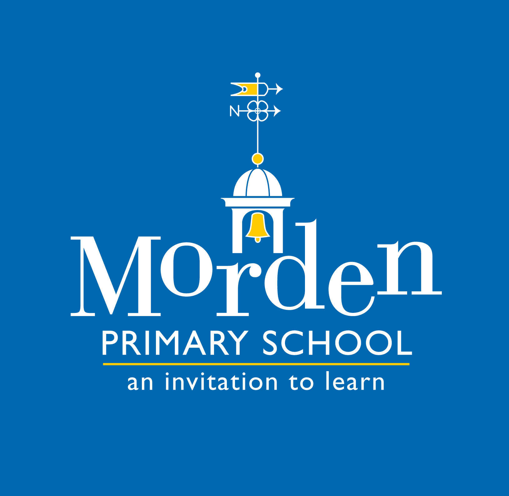
Morden Primary School.
An invitation to learn.
Logo design for Morden Primary School which features their iconic weathervane and uses whimsical typography which is both energetic and fun, representing the culture of the school.

Signage design for Morden Primary School.

Logo design for Friends of Morden School in colour.

Solefield School.
Value yourself. Value others. Value our world.
A new approach to boys’ preparatory education. Prospectus design informed by strategic workshops.
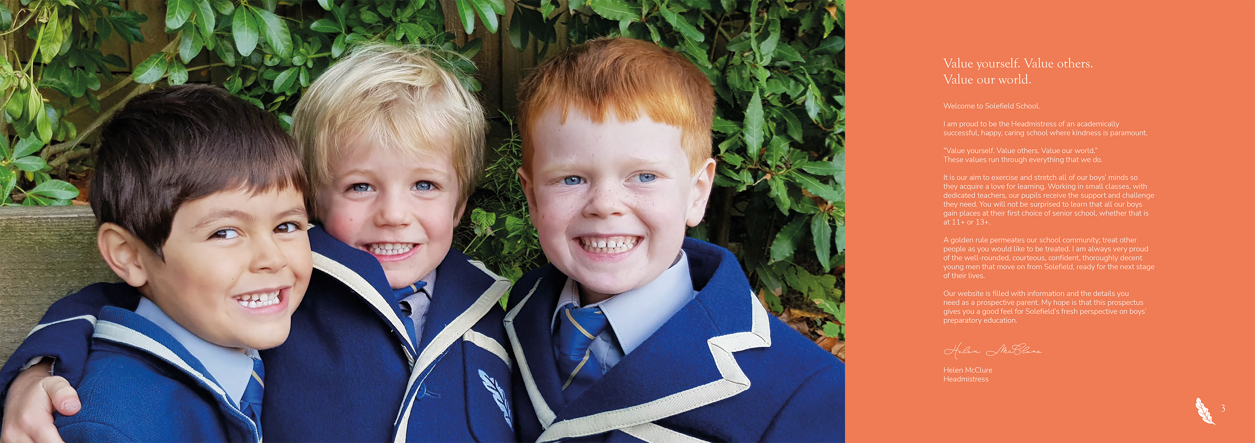
Prospectus design for Solefield School, Sevenoaks (interior pages).

Prospectus design for Solefield School, Sevenoaks (interior pages).
The Brand Wheel.